
Experience a tailored walkthrough of our solution and find out how it fits your workflow perfectly.
Contact Us
- +1 (346) 772 7281
- [email protected]
- 17350 State Highway 249, Ste 220 Houston Texas 77064
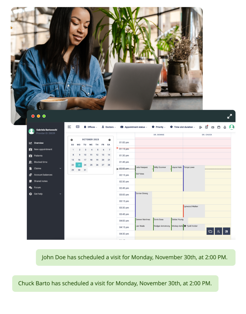
Digital Patient Chart includes a real-time KPI dashboard that pulls from live practice data, not a nightly batch export or a separate analytics database. Revenue, scheduling, patient, and clinical metrics update as events happen. When a payment processes, the revenue chart updates. When a patient no-shows, the no-show rate recalculates. The dashboard includes provider-level comparison, multi-office filtering, and period-over-period trending with date range presets. The data lives in the same system that runs the practice. There is nothing to sync.
Revenue, appointment counts, no-show rates, and patient retention update as events occur. There is no end-of-day report to wait for. The numbers reflect what has happened up to the current moment.
Compare visits, revenue per visit, SOAP note completion rates, and productivity across providers. Identify which providers are at capacity and which have availability without asking each one individually.
Compare this month to last month, this quarter to last quarter, or any custom date range. Trend indicators show whether each metric is improving, declining, or flat relative to the comparison period.
Practices with multiple locations filter the dashboard by office, by provider, or by both. Each view reflects the selected scope without mixing data from other locations.
What the KPI dashboard tracks
The KPI dashboard activates with the practice\u2019s first data. Our onboarding team configures the dashboard layout, sets up multi-office and provider filtering, defines the period-over-period comparison defaults, and trains practice owners on interpreting the metrics so they can monitor practice performance from the first week on the system.
Read More


We use first-party cookies to run this site and understand how patients find us. Privacy